How to Use the Cohort Report in Apptrove to Measure Campaign Performance Over Time?
Every marketer knows the frustration: a campaign looks great on install day, but two weeks later, those users have vanished. The install metric told you someone arrived. The Cohort Report tells you whether they stayed, and more importantly, why.
Most MMP dashboards surface top-line numbers that hide what actually happened after the click. Apptrove’s Cohort Reporting cuts through that noise. It groups users by the day, week, or month they first engaged with your app, and then tracks their behaviour across shared time periods, so you can compare campaign-to-campaign and channel-to-channel.
This guide walks you through exactly how to access, read, configure, and act on the Cohort Report inside Apptrove.
What Is a Cohort Report and Why Does It Matter?
A cohort is simply a group of users who share a common starting point, usually the date of their first install or first in-app event. Instead of mixing all your users together in a single average (which can mask dramatic differences between groups), a cohort report tracks each group separately across the same relative time intervals.
Why this matters for mobile marketers:
Imagine you ran a Google Ads campaign in Week 1 and a Meta campaign in Week 2. Both brought in 5,000 installs. A standard report would show 10,000 installs total. A cohort report would reveal that Week 1 users generated significant revenue through Day 6, while Week 2 users dropped to ₹0 by Day 1. That difference is the insight that determines whether you double down on Google Ads or rethink your Meta creative entirely.
Cohort analysis answers the questions that standard reports simply cannot:
- Which media source brings users who actually stick around?
- Is my Day 1 onboarding effective at driving Day 7 return?
- Did a product update improve long-term engagement for new users?
- Which campaign generated the highest revenue per user over 30 days, not just the most installs?
If you are working with a retention report to understand loyalty patterns, the Cohort Report is its natural companion; one shows you aggregate drop-off, the other shows you exactly which group drove it.
Accessing the Cohort Report in Apptrove
Log in to your Apptrove dashboard and get oriented with the navigation panel on the left side of the screen.
The Apptrove dashboard is your starting point upon login before navigating to the Cohort Report. The left navigation panel contains everything you need.
Once inside the dashboard, follow these three steps:
Step 1: In the left-hand navigation panel, go to the Analyze section.
Step 2: Click on Reports to expand the submenu.
Step 3: Select Cohort Report, look for the Beta badge next to it, from the list of available reports.
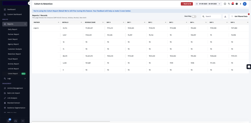
The Cohort & Retention report shows the Partner column, Installs, Revenue (Sum), and Day 0 through Day 6 revenue breakdowns. The “Cohort Report (Beta)” label is visible in the left navigation under Analyze > Reports.
You will land on the Cohort & Retention view. The page header confirms your active date range (top right) and timezone (below the title). A blue information banner at the top reminds you that this feature is currently in Beta, and your feedback helps Apptrove refine it further.
Tip: If you have just integrated the Apptrove SDK and are looking at a fresh account, give it at least 7–14 days of data before concluding the Cohort Report. Cohorts need time to mature before later intervals become meaningful.
Configuring Your Cohort Report: The Filters Panel
Click Get Filtered Data in the top-right corner of the report. This opens the full configuration panel, the most important step before reading any numbers.
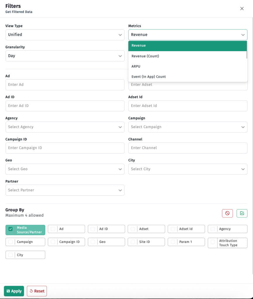
The “Get Filtered Data” configuration panel. From here, you control View Type, Granularity, Metrics, and all campaign, geo, and partner-level filters. Group By (bottom section) lets you choose up to 4 dimensions to break out your cohort rows.
Here is what each setting controls:
View Type
| Option | What It Shows |
| Unified | All installs combined, organic and non-organic in one view |
| Non-Organic | Paid and partner-attributed installs only |
| Organic | Installs with no paid attribution, your natural baseline audience |
Start with Unified to get the full picture, then narrow to Organic or Non-Organic to isolate and compare specific audiences.
Granularity
| Option | Best Used For |
| Day | High-volume apps; post-launch campaign tracking; granular day-by-day analysis |
| Week | Most apps smooth daily noise while preserving meaningful trend lines |
| Month | Low-volume apps; subscription or fintech products with longer user cycles |
Weekly granularity is the recommended starting point for most growth and marketing teams.
Metrics
This is where the Cohort Report becomes genuinely powerful. Apptrove offers four distinct metrics to track across your cohorts:
| Metric | What It Measures | Best For |
| Revenue | Total revenue generated by a cohort at each time interval | Monetisation benchmarking; channel-level ROI |
| Revenue (Count) | Number of revenue-generating transactions per cohort | Understanding purchase frequency, not just total value |
| ARPU | Average Revenue Per User within a cohort at each interval | Comparing cohort quality across different install volumes |
| Event (In App) Count | Number of times a specific in-app event was completed | Onboarding analysis; feature adoption; funnel tracking |
Switching between these metrics tells completely different stories from the same underlying data. A cohort with average total Revenue may show exceptional ARPU, meaning fewer but significantly higher-value users. That is a very different strategic signal than high Revenue driven purely by volume.
Campaign and Channel Filters
Use these fields to isolate specific campaigns, ad networks, ad IDs, or adsets:
| Filter | Use Case |
| Agency | Compare cohort quality across media buying agencies |
| Campaign | Isolate a single campaign’s cohort behaviour |
| Campaign ID | Drill into an exact campaign ID for precise matching |
| Channel | Compare cohort behaviour across distribution channels |
| Geo / City | Understand regional retention and revenue differences |
| Partner | Filter by specific ad network or media partner |
| Ad / Adset | Granular creative-level cohort comparison |
Group By
The Group By section at the bottom of the panel (maximum 4 dimensions) controls how cohort rows are broken out in the grid. The default grouping is Media Source / Partner. You can add Campaign, Geo, Ad, Adset, Agency, Attribution Touch Type, Site ID, Param 1, and more to build multi-dimensional cohort views.
Once configured, click Apply to load your filtered cohort view. Click Reset at any time to return all settings to default.
Reading the Cohort Grid
With your filters applied, you are now looking at the cohort grid, the heart of the entire report.
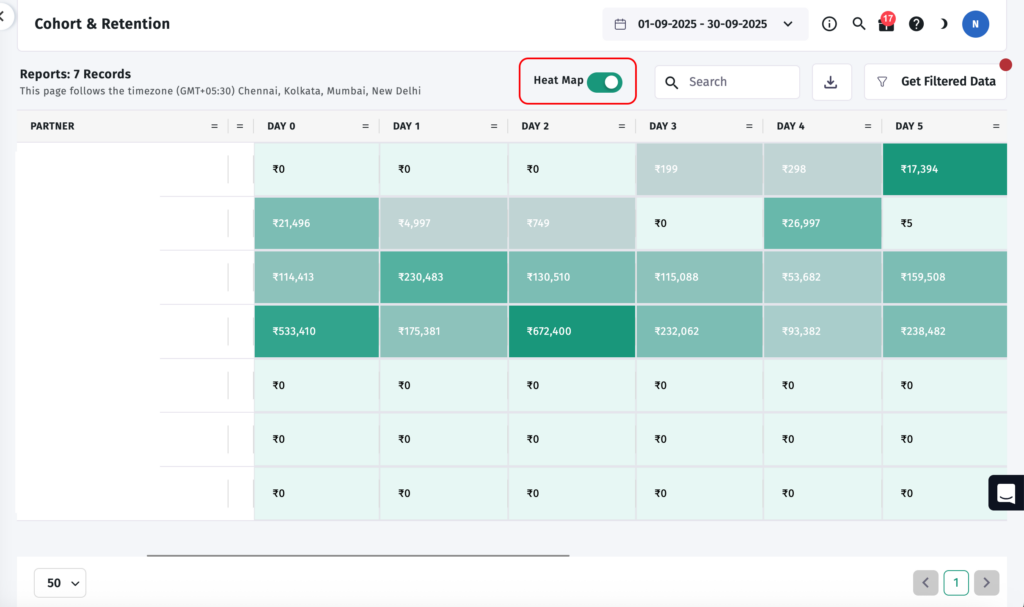
The Cohort & Retention grid with the Heat Map toggle switched ON (highlighted in red). Darker teal cells indicate higher revenue values; lighter cells show lower values. The pattern becomes immediately readable, no need to scan individual numbers row by row.
Here is how to decode what you are seeing:
Each row is a cohort segment defined by your Group By selection, for example, a specific media partner, campaign, or geo.
Each column is a relative time interval after the cohort’s starting event, Day 0 (the install day itself), Day 1, Day 2, Day 3, and onwards through your full date range.
Each cell shows the value of your chosen metric (Revenue, ARPU, Event Count, etc.) for that cohort at that specific time interval.
Turning On the Heat Map
Toggle the Heat Map switch in the top-right of the report. When enabled, cells become colour-coded in teal: darker shades indicate higher values, lighter shades indicate lower values. Empty or zero cells stay light.
The Heat Map is especially useful when you have many rows, multiple partners or campaigns, and want to instantly see which cohorts are over- or under-performing at specific intervals without parsing each number manually.
Three Ways to Read the Grid
1. Read down a column, cross-cohort comparison at the same time interval
Pick any column (Day 3, for example) and read from top to bottom. You are comparing how different cohorts performed at the same point in their lifecycle. If one partner’s Day 3 Revenue cell is consistently darker than all others, that partner is bringing higher-quality users, regardless of install volume.
2. Read across a row, a single cohort’s lifecycle
Select any row and read left to right. You are watching one cohort’s behaviour evolve. A steep drop from Day 0 to Day 1 typically signals a first-session experience problem. A gradual, smooth decline is healthier, and a plateau that appears at Day 3 or Day 7 often marks your core retained user segment.
3. Find the plateau
Most cohorts stabilise at some revenue or retention level after the initial drop-off period. The interval where that stabilisation happens, often Day 3 to Day 7 for most mobile apps, is your retention plateau. Users who make it past this point tend to become your most valuable long-term users. Your onboarding goal is to get as many new users as possible past this threshold.
Practical Scenarios: Using Cohort Data to Make Decisions
Scenario 1: Evaluating a New Ad Network
You onboarded a new ad network, and it is reporting strong install numbers. Before scaling spend, open the Cohort Report, filter by that Partner, and compare its Day 3 and Day 7 Revenue against your Organic cohort and your established paid partners.
If the network’s cohort shows ₹0 across Day 1 through Day 6, while your organic cohort shows consistent revenue, you are likely seeing high-volume, low-quality traffic that does not convert after install. Apptrove’s Fraud Shield can help you investigate further, but the Cohort Report gives you the first signal before you waste more budget.
Scenario 2: Measuring the Impact of an Onboarding Change
Your product team updated the onboarding flow. To measure whether it worked, compare cohorts from the week before the change against cohorts from the week after. Set the metric to Event (In-App) Count for your key onboarding event, and look at Day 1 and Day 3 specifically.
If the post-change cohort shows a meaningful increase in event completions at Day 1, the onboarding update is having a measurable effect on early activation, and you have data to share with your product team.
Scenario 3: Identifying Your Best Revenue Cohort
Set the metric to ARPU and filter by Campaign. You may find that one campaign brings users with dramatically higher average revenue per user across Days 7–30, even if it delivered fewer total installs.
This is exactly the insight that should trigger budget reallocation. ARPU over 30 days is a far more reliable signal of campaign quality than cost-per-install, and the Cohort Report is the only place in Apptrove where you can see it this clearly.
Scenario 4: Planning Re-engagement Campaigns
If your cohort data shows revenue consistently dropping to ₹0 at Day 4 or Day 5 across multiple partner cohorts, that interval is your re-engagement window. Use Apptrove’s Audience Segmentation to build a targeted group of users approaching that drop-off point and reach them with a deep-linked offer or push notification before they go quiet.
This is far more precise than generic “lapsed user” campaigns that target anyone who has not opened the app in 30 days.
Cohort Report vs. Retention Report: When to Use Each
Both reports sit under the Analyze section in Apptrove and are designed to be used together. Here is a clear guide for which one to reach for:
| Question You Are Asking | Use This Report |
| Are my users coming back at all? | Retention Report |
| Which campaign’s users come back more? | Cohort Report |
| When do users typically drop off? | Retention Report |
| Is drop-off improving cohort over cohort? | Cohort Report |
| Which media source delivers the best long-term value? | Cohort Report |
| Did a product or onboarding change improve loyalty? | Cohort Report |
| Which users should I target for re-engagement? | Both: Retention for timing, Cohort for segmentation |
Use the Retention Report to understand the broad shape of user loyalty. Use the Cohort Report when you need to attribute that loyalty, or the lack of it, to a specific campaign, channel, time period, or product decision.
Common Mistakes to Avoid
Comparing cohorts of very different sizes using Revenue (Sum): A partner cohort of 88,470 installs and a partner cohort of 9 installs will produce Revenue figures that are not meaningfully comparable. Use ARPU when comparing cohorts with very different install volumes; this normalises for size and gives you a fair quality comparison.
Concluding immature cohorts: A cohort that is only 3 days old cannot tell you anything about Day 14 or Day 30 performance. The grid will show empty or zero cells for intervals that have not yet passed. Wait for cohorts to fully mature before making strategic decisions based on later-interval data.
Ignoring the Day 0 to Day 1 drop: Most apps see a significant revenue drop between Day 0 and Day 1. But if revenue collapses to ₹0 at Day 1 across most cohorts, you have a first-session monetisation problem that re-engagement campaigns alone will not solve. The in-app experience needs attention first.
Running the report without any filters: The aggregate, unfiltered Cohort Report mixes all partners, campaigns, and user types into one view. This almost always hides the most actionable insight. Always apply at least a Partner or Campaign Group By before concluding.
Skipping the Heat Map: The Heat Map is off by default. For any report with more than four or five rows, always enable it; the colour-coding reveals patterns in seconds that would take minutes to find by scanning raw numbers.
Quick Checklist: Running Your First Meaningful Cohort Report
| Step | Action |
| 1 | Go to Analyze → Reports → Cohort Report in your Apptrove dashboard |
| 2 | Click Get Filtered Data in the top right |
| 3 | Set View Type to Unified |
| 4 | Set Granularity to Week |
| 5 | Set Metric to Revenue |
| 6 | Under Group By, keep the default Media Source / Partner |
| 7 | Click Apply |
| 8 | Toggle Heat Map ON for instant visual pattern recognition |
| 9 | Read down the Day 7 column, and compare partner revenue values |
| 10 | Switch metric to ARPU and see if the partner ranking changes |
| 11 | Note the partner with the highest ARPU, that is your quality benchmark |
| 12 | Schedule a weekly calendar reminder to run this same view every Monday |
Final Thoughts
The Cohort Report is one of the most powerful analytical tools inside Apptrove, and consistently one of the most underused. Most teams check their install counts daily and their revenue weekly, but very few make cohort analysis a routine part of their decision-making.
That gap is an opportunity. Teams that understand which campaigns bring users who return, spend, and advocate, not just users who install, are the ones that build sustainable app growth rather than chasing the next install spike.
Start with one question. Run one filtered cohort comparison this week. The answer will almost certainly change how you think about your next budget allocation.
We are delighted to have assembled a world-class team of experienced professionals who are ready to take care of your queries and answer any questions you may have. Feel free to reach out to us at any time by emailing us at support@apptrove.com or by using the in-platform chat feature. We’d love to hear from you!
from Apptrove https://apptrove.com/how-to-use-the-cohort-report-in-apptrove/
via Apptrove

Comments
Post a Comment