Custom Dashboard: How to Create and Customize Analytics Views in Apptrove?
When presented in a format that aligns with your goals, data becomes more valuable to your company. Apptrove offers a way for you to create custom dashboards that allow you to create personalized analytics views. This will allow you to monitor the metrics that are most important to you regarding your company’s performance. You can use custom dashboards to monitor installs, revenue, user engagement, or your campaign performance, with all of this flexibility available on one customizable dashboard.
Using widgets, filters, and customizable layouts gives you the ability to visually organize and display your data in ways that will be helpful to your current situation. This means you can visualize your overall key performance indicators in real-time and quickly access meaningful insights about your business.
The Steps to Create a Custom Dashboard:
To set up a custom dashboard, you will be guided through a series of straightforward steps.
Step 1: Creating a new dashboard
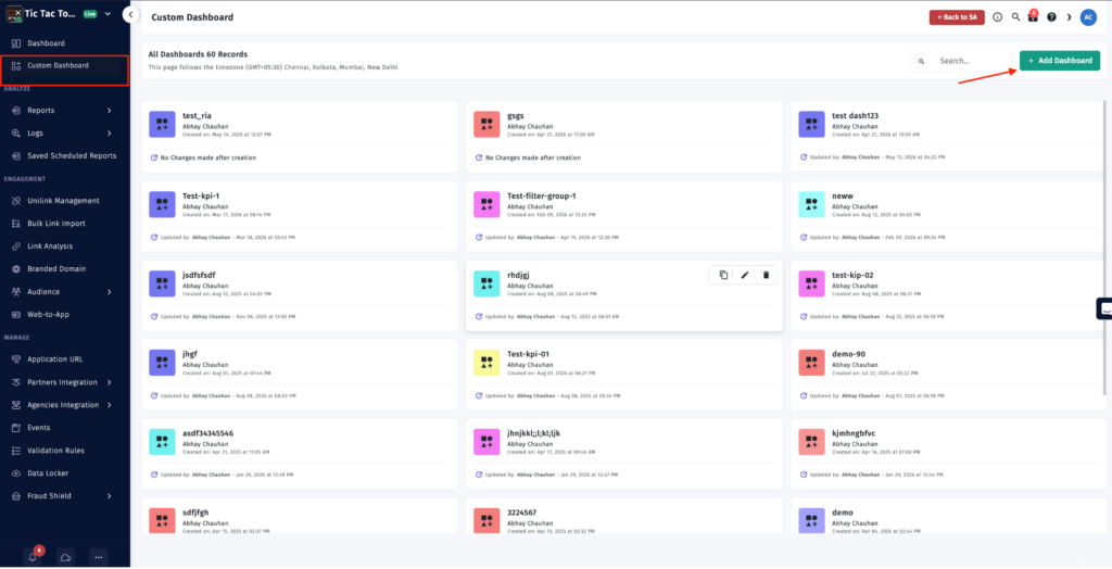
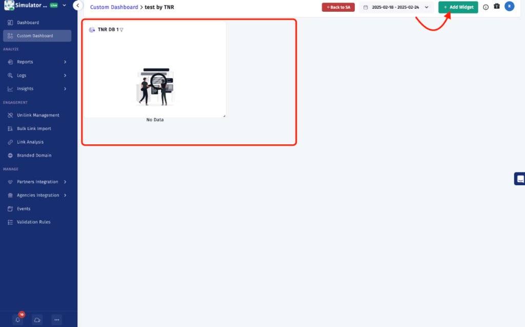
To begin the process of creating your custom dashboard, go to the Custom Dashboard section in your sidebar. Once you click on the Add Dashboard button, you will be prompted to enter a name for your new dashboard. This step will create your first custom dashboard, and you can now start adding widgets and analytics components to suit your needs.
Step 2 – Add Widgets to the Dashboard
You may start adding widgets to your newly created dashboard, which does have multiple widgets by adding multiple widgets, so we can have various types of metrics or views in one place.
Step 3 – Determine What Type of Chart Will Best Fit Your Data
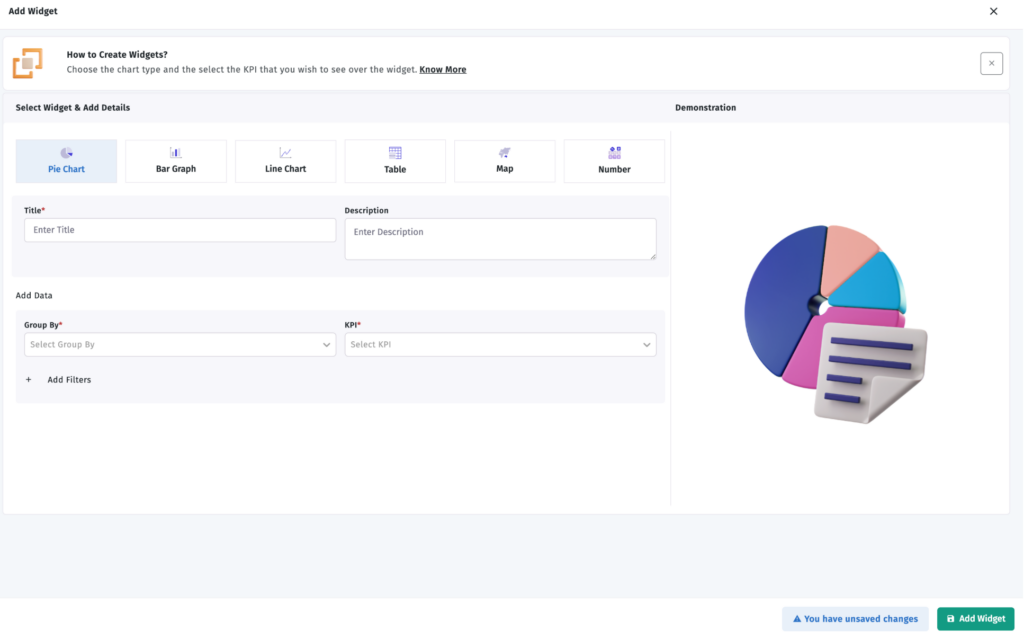
One of the more important pieces of creating a widget is the simplicity of choosing the appropriate chart to represent best the data you have chosen to display.
There are several different chart options available to give you the best representation of your chart to make your custom dashboard more readable and/or analyze.
- Pie Chart
- Bar Chart
- Database
There are many types of charts available to make your custom dashboard easier to read and analyse.
Step 4 – Enter/Set Widget Parameters
After you have selected the chart to display your widget, you will need to enter/define some parameters for your widget.
- You will need to enter a widget name.
- You will also need to enter a widget description.
You will then select a KPI that you will use for tracking, and you will also need to select the attribute that will group the data within the custom dashboard.
These parameters will allow you to show your intended data in your custom dashboard and create valuable and actionable insights.
Understanding the Group By Options
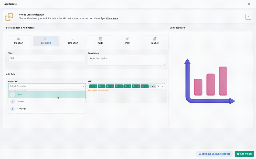
The group by feature will allow you to better organise and segment the data in your custom dashboard so that you will be able to analyse and/or report that data more effectively.
Date
Grouping by specific date lets you monitor trends in your data and assess your performance on a daily, weekly or monthly basis.
Partner
Grouping by specific partners allows you to analyze your data based on your traffic sources and/or affiliates and determine how your partners are performing.
Campaign
Compare the effectiveness of marketing campaigns with respect to expenditures in order to calculate ROI.
Campaign ID
Aggregate data across all platforms for the same campaign ID in order to perform reconciliation at the platform and organizational level.
Ad Set
Compare the efficacy of various target segments by analyzing the performance of campaign ads at the ad set level.
Ad
Evaluate individual ads to measure how effectively they have performed with respect to creativity and level of engagement.
Country
Assess performance across country, region and geography.
Site ID
Evaluate campaign performance based on the specific websites or apps where the ad was placed.
Channel
Aggregate data by each Marketing Channel so that all acquisition sources can be compared.
Agency
Analyze performance based on which agency managed each campaign.
Event
Evaluate engagement and conversion activity based on specific in-app event types.
Template
Group data based on the UniLink or campaign template used to create links.
Template ID
Evaluate campaign performance based on the unique identifier assigned to each template.
Link
Measure campaign performance based on individual tracking and deep link performance.
Link ID
Aggregate data using individual link identifiers for link-level reporting.
Ad ID
Analyze performance of individual ads using the unique identifiers assigned to each ad.
Ad Set ID
Audience Segment Outcomes – Review campaign results by ad set or audience segment.
Subsite ID
Subsite Traffic – Break down overall traffic based on subsite(s)/publication, inventory and financial sub-publisher(s). By doing so, this gives you a better understanding of how your campaigns are performing through different channels.
Customer ID
Activity Analysis Based on Customer ID – You are able to analyze your activity based on the customer ID sent to you from Apptrove; this would give you all the customer activity attributed to their specific customer id.
Customer Name
Group Data by Customer’s Name – You can group your data together by the name of your customer.
Customer Phone Number
Segmenting by phone number(s) – You can segment your data by customer phone numbers when available to do so.
Customer Email
Analyze Events & Conversions based on Customer Email Identifier(s) – You may also segment out your event and conversion activity based on email identifier(s).
Utilizing these groupings when creating a custom dashboard will help to organize large amounts of data in order to identify trends; it should be used to make reporting easier.
Key Performance Indicators (KPI) Available In A Custom Dashboard
Choosing which KPIs to use is critical to measuring performance effectively. Apptrove offers a variety of options for KPI selection through creating a custom dashboard.
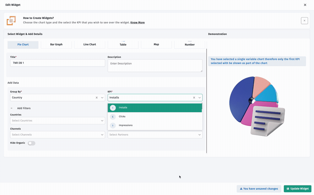
Installs – Displays total installs received by app within a defined date span.
Clicks – Displays total clicks received by all partners for your app.
Impressions – Displays total impressions received by the app.
Conversion Rate (%) – Measures the percentage of clicks generating a successful conversion (successful app install).
Cost – Displays the total cost of the app for the defined period.
Revenue – Displays total revenue received by the app.
Uninstalls – Represents the number of uninstalls from the application during the selected time frame by providing metrics pertaining to the number of times an application has been uninstalled in that time frame.
In-App Events
Represents the total number of in-app events that occurred in the selected date range.
Fraudulent Installs
Represents the number of fraudulent installs that were identified.
Fraudulent Events
Represents the total number of fraudulent events that were identified.
Session
Represents the number of active user sessions during which they were using the application. (Sessions are defined as the time period over which a user was actively engaged with the application.)
ROI
Represents the ROI that was generated from campaigns for the application.
Unique Events
Represents the number of unique user actions that occurred within the application.
These are the KPI options that are at your disposal when building a custom dashboard, thus allowing for an overall view of the application’s performance as well as how users are utilizing the application.
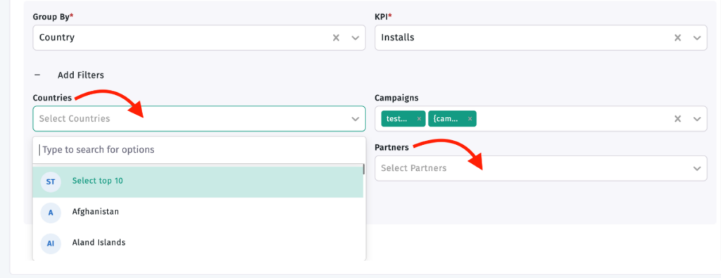
Use Filters to Filter Down Your Data
Apptrove gives you the ability to create filters on a custom dashboard to filter out information, so you can end up with data that is only relevant to your analysis requirement.
The filtering methods include:
- Campaigns
- Countries
- Partners
- Channels
- Organic Data
By using filtering to filter data from your custom dashboard, this ensures that the only data presented in your custom dashboard is relevant to your analysis requirement.
Customise Your Dashboard Layout
After adding your widgets to your dashboard, the layout of the custom dashboard can be changed and rearranged to your preferred layout.
You can:
- Resize widgets
- Move widgets
- Rearrange dashboard components
This flexibility allows you to build a custom dashboard that aligns with your reporting needs and provides quick access to important performance metrics.
Final Thoughts
You can use a custom dashboard that allows you to access information about your business’s performance through various methods, including providing a collection of widgets, KPIs, filters and grouping options within one view. By allowing users to set up visualizations of data in a way they find most comfortable, such as arranging metrics in a manner they prefer and changing the overall layout of the dashboard, a custom dashboard makes it easier to review business performance and access important information.
from Apptrove https://apptrove.com/how-to-create-a-custom-dashboard-in-apptrove/
via Apptrove

Comments
Post a Comment