Cracking the Code: How to Benchmark and Boost App Opt-In Rates
Opt-in rate tells you how many users agreed to a permission request. That’s useful. But it doesn’t tell you why they agreed, whether they’ll ever engage with what they consented to, or whether that consent contributes anything meaningful to your growth metrics. Those questions matter considerably more than the percentage itself.
For mobile apps, push notification opt-in and ATT opt-in are the two consent metrics that come up most often. They’re different, they behave differently across platforms, and they require different measurement approaches. Getting them confused, or conflating them into one “consent number,” leads to decisions built on incomplete information.
This page covers what opt-in rates actually measure, how to calculate them correctly, what the 2026 benchmarks look like by industry and platform, and what actually moves the needle when you want to improve them.
What Is an Opt-In Rate?
An opt-in rate is the percentage of users who say yes to a permission request after being given the choice to accept or decline.
Simple enough. What gets complicated is defining who’s in the denominator. Two apps can both report a 40% opt-in rate while measuring completely different populations. One calculates it against all eligible users. Another only counts users who were actually shown the prompt. Those are different numbers, and comparing them directly produces misleading conclusions.
For mobile apps, the two permission types that come up most often are:
Push notification opt-in: Whether users allow the app to send them notifications.
ATT opt-in: Whether iOS users allow tracking under Apple’s App Tracking Transparency framework.
These are not the same metric. Treat them separately. More on that distinction below.
How Do You Calculate Opt-in Rate?
The formula is:
Opt-In Rate = Users Who Opted In / Users Asked for Permission x 100
Straightforward, but the denominator is where teams trip up. Define it precisely before comparing your numbers with any external benchmark, because that benchmark’s denominator is almost certainly different from yours unless you’ve checked.
A quick example:
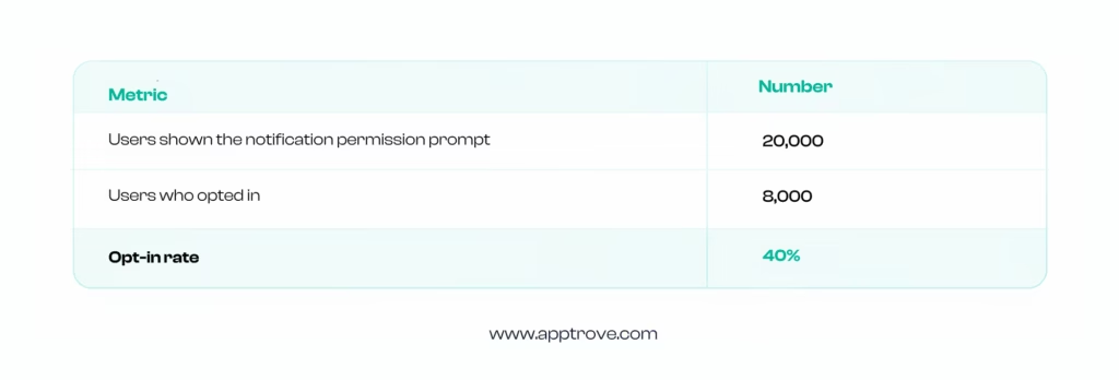
That’s the calculation. The harder question is what that 40% actually means for your specific app, category, and user base. And that brings us to benchmarks.
Why Does Opt-In Rate Actually Matter?
Opt-in determines whether you can use a given channel with a given user. For push notifications, a user who opts in becomes reachable outside the app. That gives you a direct line for re-engagement, updates, time-sensitive messages, and retention campaigns.
Research from Airship suggests opted-in users can show higher purchasing activity than opted-out users, though this is worth treating as an observed association rather than proof that the opt-in itself causes higher spending. Users who see enough value in an app to allow notifications are probably more engaged to begin with.
What opt-in rate actually feeds is the addressable audience for:
- Re-engagement campaigns
- Lifecycle messaging
- Transactional communication
- Personalized push campaigns
- Retention initiatives
But a higher opt-in rate is not automatically better. An opted-in user who never opens a single notification adds nothing. What matters is the combination of consent and downstream engagement.
That’s why opt-in should never be read in isolation. Read it alongside click-through rate, engagement rate, retention, and conversion rate. The opt-in is the starting point, not the outcome.
Opt-In Rate Benchmarks: Average Push Opt-In Rates by Industry
Here’s where it gets genuinely useful. OneSignal’s State of Customer Engagement 2026 report, based on data from 200,000+ apps, provides the most comprehensive current breakdown of push notification opt-in rates by industry across both iOS and Android.
Average push opt-in rates, by industry (iOS and Android)
(Source: OneSignal Customer Engagement Report Survey 2026)
| Industry | iOS | Android |
| Agriculture | 68% | 69% |
| Business Services | 46% | 46% |
| Construction | 73% | 74% |
| Consumer Services | 45% | 46% |
| Education | 59% | 58% |
| Energy, Utilities & Waste | 47% | 50% |
| Finance | 61% | 65% |
| Government | 67% | 83% |
| Healthcare Services | 48% | 48% |
| Holding Co. & Conglomerates | 35% | 48% |
| Hospitality | 50% | 36% |
| Hospitals & Physicians Clinics | 56% | 28% |
| Insurance | 48% | 28% |
| Law Firms & Legal Services | 45% | 59% |
| Manufacturing | 36% | 48% |
| Media & Internet | 45% | 48% |
| Minerals & Mining | 77% | 53% |
| Organizations | 49% | 20% |
| Real Estate | 45% | 69% |
| Retail | 45% | 51% |
| Software | 38% | 39% |
| Telecommunications | 36% | 48% |
| Transportation | 51% | 54% |
A few things immediately stand out from this data.
Construction sits at 73% iOS and 74% Android. Minerals and Mining sits at 77% iOS. Government sits at 67% iOS and 83% Android. These are industries where users have a practical reason to allow notifications: site updates, safety alerts, compliance communications. The value exchange is obvious before the prompt even appears.
At the other end, Software at 38-39%, Telecommunications at 36-48%, Retail at 45-51%. More competitive categories where notification value is less immediately obvious, and trust has to be established before asking for consent.
The main takeaway: your category benchmark matters far more than any cross-industry average. A retail app at 45% iOS opt-in is performing right at the benchmark. A construction app at 45% has a problem.
Average Retention Rates by App Category
Opt-in rates don’t exist in a vacuum. Data also shows average 1, 7, and 30-day retention rates across app categories, which give important context for understanding how opt-in performance connects to longer-term engagement.
Average 1, 7, and 30-day retention rates by app category
| Category | Day 1 | Day 7 | Day 30 |
| Book | 50% | 36% | 17% |
| Business | 51% | 40% | 20% |
| Developer Tools | 34% | 23% | 11% |
| Education | 57% | 43% | 21% |
| Entertainment | 49% | 35% | 14% |
| Finance | 54% | 43% | 23% |
| Food & Drink | 48% | 38% | 19% |
| Games | 43% | 27% | 11% |
| Graphics & Design | 31% | 21% | 9% |
| Health & Fitness | 56% | 46% | 26% |
| Lifestyle | 54% | 41% | 22% |
| Magazine & Newspapers | 47% | 36% | 19% |
| Medical | 59% | 47% | 23% |
| Music | 35% | 24% | 10% |
| Navigation | 57% | 45% | 24% |
| News | 66% | 47% | 20% |
| Photo & Video | 36% | 26% | 10% |
| Productivity | 47% | 36% | 19% |
| Reference | 29% | 21% | 10% |
| Shopping | 56% | 43% | 19% |
| Social Networking | 47% | 32% | 14% |
| Sports | 58% | 45% | 22% |
| Travel | 53% | 38% | 17% |
| Utilities | 38% | 27% | 13% |
| Weather | 52% | 42% | 22% |
These retention numbers explain why opt-in timing matters so much. Games have 43% Day 1 retention but only 11% at Day 30. If you ask for notification permission at Day 1, you might catch a user who never comes back. If you wait for the user to establish a pattern of return, you’re asking a much more engaged audience.
Health and Fitness at 56% Day 1 and 26% Day 30 represents one of the stronger retention profiles across categories, which partly explains why health apps can build genuine notification relationships with users over time.
Transportation at 11.76% churn and Energy, Utilities & Waste at 12.9% are the lowest. These are utility-style apps with sticky use cases. Users come back because the app is woven into something they do regularly, not because of how good the engagement campaigns are.
Agriculture at 30% and Consumer Services at 29.74% at the other end. High-churn industries need consent-based channels working hard to re-engage users before they drift completely.
The connection between opt-in rate and churn is worth thinking about. Industries with higher opt-in rates often have lower churn. That’s not a coincidence. Apps that users trust enough to allow notifications are probably apps they’re planning to keep using.
How iOS and Android Opt-In Rates Differ
The platform story has changed. Understanding why matters for how you interpret historical data and benchmark against peers.
The 2026 OneSignal report makes a specific observation about this: historically, Android had seen higher opt-in rates simply because notifications were effectively on by default for many apps. Since Android 13, notifications moved to an opt-in runtime permission model, meaning new installs require explicit user permission just as iOS does.
The result: the Android/iOS delta has narrowed considerably. Teams that treat opt-in as part of onboarding strategy, getting the timing, framing, and proof of usefulness right, tend to outperform on both platforms now.
What this means practically: if you’re looking at historical Android opt-in data from before Android 13, those numbers aren’t comparable to current Android performance. Treat anything from that era as a different measurement context.
Current segmentation should separate iOS and Android clearly, by OS version, app version, and date range. Don’t average them together and report one number.
What Factors Actually Move Opt-In Rates?
- Timing
When you ask is arguably more important than what you say. An opt-in request during onboarding, before a user has experienced any app value, gives users no reason to say yes. They don’t know what they’re consenting to receive.
The stronger approach is connecting the request to a moment where the user has just done something the notification would logically support. A user who has placed their first order is primed to understand delivery notifications. The same user, five minutes after installing the app, isn’t.
- Context and pre-permission messaging
Apple’s native ATT prompt and the Android permission dialog are fixed. The system controls the permission prompt itself, but you can control the purpose string on iOS and when you request permission.
A pre-permission screen, sometimes called a pre-prompt, lets you explain in plain language what the permission enables and why it benefits the user. Done well, this gives users the information they need to make an informed decision rather than defaulting to “no” because the system dialog offers no context.
- Value communication
“Enable notifications” is not value communication. “Get order updates from dispatch to delivery” is. The difference is specificity. Users make better decisions when they know what they’re actually consenting to.
- App category dynamics
Some categories have inherent trust advantages. Finance apps can lean on security alerts and transaction notifications. Healthcare apps can emphasize appointment reminders and health tracking. Gaming apps need to work harder to explain what notifications add to the experience, because the default assumption is promotional.
Know your category’s trust starting point and adjust your permission messaging accordingly.
- User intent
Users who installed because of a specific need are more motivated to complete the steps that support that need, including granting permissions. Users who arrived through broad-reach campaigns are often less certain about what they want from the app and are more likely to decline requests they don’t understand.
This is why cohort-level opt-in rate analysis matters. Your overall opt-in rate might be 40%. Your opt-in rate for users from a specific high-intent acquisition source might be 60%. Those are different populations with different receptiveness to engagement.
How to Measure Opt-In Rate Properly
The overall opt-in rate is an important app analytics metric. Here’s what to track instead:
- Opt-in rate by platform: iOS and Android separately. Different baselines, different user expectations, different historical contexts.
- Opt-in rate by OS version: Catches whether system-level changes are affecting consent behavior independently of your app experience.
- Opt-in rate by app version: Shows whether product changes moved the needle.
- Opt-in rate by acquisition source: Reveals whether certain channels are bringing users who are more or less receptive to consent requests.
- Opt-in rate by geography: Different markets have different trust dynamics and data privacy expectations.
- Opt-in rate by user cohort: New users versus returning users often behave very differently.
- Downstream engagement of opted-in users: Notification delivery rate, open rate, click-through rate, conversion rate, retention, revenue. These tell you whether the opt-in was worth something.
That last one is the most important. Opt-in rate without downstream engagement data answers the wrong question.
Common Mistakes That Suppress Opt-In Rates
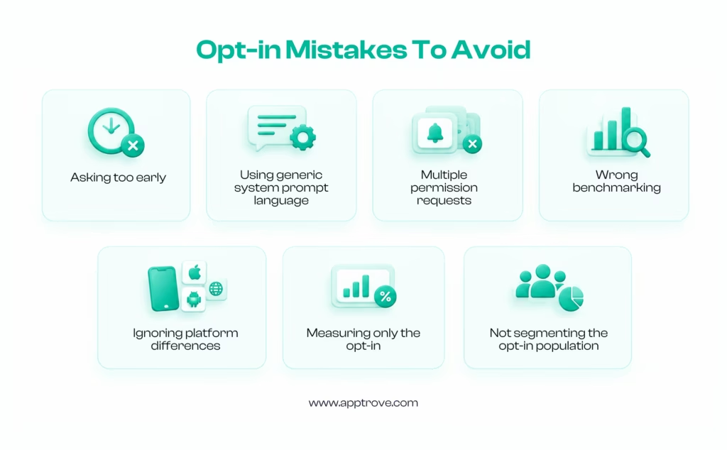
- Asking too early. Before users understand the app’s value, permission requests land without context.
- Using generic system prompt language without pre-permission context. The system dialog is fixed and gives users no reason to say yes.
- Multiple permission requests in quick succession. Users decline when they feel overwhelmed.
- Comparing against the wrong benchmark. A retail app benchmarking against overall cross-industry averages is comparing itself to the wrong cohort.
- Ignoring platform differences. iOS and Android behave differently and should be optimized separately.
- Measuring only the opt-in. Permission without downstream engagement is just a number.
- Not segmenting the opt-in population. An overall rate hides the signal that would actually drive improvement.
What Actually Improves Opt-In Rates?
The 2026 OneSignal report is clear about what’s working across teams: behavior-triggered messages consistently outperform standard sends by 4x to 9x on CTR. Event-triggered mobile push reached 4.38% CTR compared to 0.91% for standard targeting and 0.48% for untargeted sends. That same principle applies to the opt-in moment itself.
The most effective opt-in improvements are:
- Use a pre-permission experience. Before the system prompt appears, show a screen that explains the specific value the user gets by allowing notifications. Timing, framing, and proof of usefulness are the variables to test.
- Connect the request to a relevant user action. The ask works best when it feels like a natural next step from something the user just did, not a standalone interruption.
- Test your messaging specifically. “Allow notifications to get delivery updates” outperforms “Allow notifications to stay informed.” The specific version tells users what they’re actually getting.
- Segment your approach by cohort. Users from different acquisition sources, geographies, and device types respond differently to the same consent experience. A single approach optimized for the aggregate often underperforms on every segment individually.
- Measure downstream, not just the opt-in. A variation that improves opt-in rate but reduces post-opt-in engagement might be moving the wrong metric. Always tie opt-in tests to downstream outcomes.
Push Opt-In vs. ATT Opt-In: Different Metrics, Different Implications
These are the two opt-in metrics mobile marketers encounter most often. They’re not interchangeable.
| Metric | What it measures |
| Push notification opt-in | Whether the user allows the app to send notifications |
| ATT opt-in | Whether the iOS user allows tracking under Apple’s App Tracking Transparency framework |
Push notification opt-in is primarily an engagement and communication metric. It determines whether you can reach users through a direct channel.
ATT opt-in is a measurement and mobile attribution metric. When a user allows tracking, certain attribution signals become available. When they don’t, measurement falls back to privacy-preserving frameworks like SKAdNetwork and AdAttributionKit.
The 2026 context here is important. iOS notification delivery now involves AI-mediated prioritization through Apple Intelligence features like Scheduled Summary. A push opt-in no longer guarantees a notification will appear in the way it once did. The OS decides whether your notification surfaces immediately, gets grouped into a summary, or gets suppressed entirely based on its model of what the user finds valuable.
This means push opt-in rate has to be read alongside delivery rate, surface rate, and downstream engagement. The opt-in is still necessary. It’s no longer sufficient.
How Does ATT Opt-In Rate Affect Mobile Attribution and What Can You Do About It?
ATT opt-in is one factor that affects the mobile attribution measurement signals available for iOS attribution. When users allow tracking, the app can access the IDFA subject to Apple’s tracking transparency rules; when they don’t, marketers rely more heavily on privacy-preserving attribution frameworks and other available measurement signals.
Here’s what that looks like in practice.
- When a user opts in, the IDFA becomes available. ATT authorisation can make additional user-level measurement signals available, which may support more granular attribution depending on the ad network and measurement setup. You can run cohort analysis, model lifetime value by acquisition source, and optimize with granular feedback loops.
- When a user opts out, attribution falls back to SKAdNetwork, or AdAttributionKit on iOS 17.4 and later. Postbacks arrive with a 24- to 48-hour minimum delay, carry no user-level information, and confirm that conversions happened within a campaign window without telling you which users converted or what they did afterwards.
The gap between these two experiences compounds quickly at scale. A team with 35% ATT opt-in has direct tracking authorisation from roughly a third of users, while measurement for the remaining users depends more heavily on privacy-preserving and platform-specific attribution signals. Every budget decision and creative optimization sits on that split foundation.
What this means for how you measure:
Tracking ATT opt-in rate alone understates the measurement challenge. Even among users who tap Allow, there are scenarios where the IDFA isn’t successfully collected or matched: SDK initialisation timing, network issues at collection, device restarts before the identifier is read. The result is that ATT opt-in rate and actual IDFA collection rate can diverge, sometimes meaningfully.
A more complete measurement picture tracks:
- ATT prompt impressions: how many users are actually being shown the prompt
- Authorized users: opted in
- Denied users: opted out
- Not determined: users who haven’t been shown the prompt yet
- Restricted: tracking disabled at device level, not app level
- IDFA collection rate: of users who opted in, how many have a usable IDFA in your attribution data
- Attribution coverage: the proportion of installs and events with user-level or deterministic attribution
What can you do to improve ATT opt-in?
The same principles that improve push opt-in apply, but with a different value frame. For push, you’re communicating what notifications the user will receive. For ATT, you’re explaining what a better experience they’ll get, typically more relevant ads, more personalised content, or a more useful product experience.
The challenge with ATT pre-prompts is being genuinely honest about what tracking enables. Users who feel misled revoke consent, and revoked ATT consent is harder to recover than never having asked. The goal is a user who understands the tradeoff and makes an informed decision in your favour, not a user who was confused into saying yes.
Specific interventions worth testing:
- Pre-prompt timing: Don’t ask on first open. Ask after the user has experienced enough of the product to understand what personalization might mean for them.
- Value framing: “We use this to show you ads that are actually relevant to what you’re browsing” is more honest and often more effective than vague references to improving experience.
- Segment by acquisition source: Users from paid campaigns often have different ATT opt-in propensity than organic users. Optimize the pre-prompt experience separately for each.
- Track consent separately from collection: Know the difference between opted-in users and users where the IDFA is actually available in your attribution data. That gap, if it exists, is a technical problem worth fixing independently of your consent experience.
ATT opt-in rate sits at the intersection of user trust and measurement quality. Improving it isn’t just about getting a higher number. It’s about building enough confidence in your product that users understand what they’re agreeing to and choose to agree anyway. That’s a different kind of work from optimizing a push prompt, and it requires honest communication rather than clever framing.
For teams using a mobile measurement partner like Apptrove, attribution coverage across both opted-in and opted-out iOS users is the metric worth watching. Because even at 38% global ATT opt-in, the 62% who declined still install, still engage, and still convert. Measuring them accurately through SKAdNetwork postback processing and probabilistic methods is how you understand the full performance picture rather than just the consented portion of it.
How Opt-In Rate Connects to App Growth
Opt-in rate sits in the middle of a larger chain:
Acquisition leads to install, install leads to onboarding, onboarding produces consent, consent enables communication, communication drives retention, retention generates revenue.
An acquisition campaign might generate high install volume but low opt-in rates if the user intent doesn’t match the app’s notification value proposition. Another campaign might acquire fewer users but a significantly higher proportion who consent and engage.
Looking only at installs misses this difference. Tracking opt-in rate by cohort, connected to downstream retention and revenue, reveals which acquisition sources actually contribute to the long-term business rather than just the install count.
Data shows that 63% of teams using automated journeys report better results with fewer messages sent. That’s the broader principle: quality of engagement beats volume of communication. Opt-in rate should be understood in that context. The goal isn’t maximum consent. It’s meaningful consent from users who will engage with what you send.
FAQs on Opt-in Rates
What is an opt-in rate?
The percentage of users who grant a particular permission or agree to receive a particular type of communication after being given the choice to accept or decline.
How do you calculate opt-in rate?
Divide the number of users who opted in by the number who were asked for permission, then multiply by 100. Define your denominator clearly before comparing with external benchmarks.
What is a good opt-in rate for mobile apps?
Depends entirely on your category, platform, and user base. Industry averages on iOS range from 35% in Holding Co. and Conglomerates to 77% in Minerals and Mining. Compare within your category, not against a cross-industry average.
Why are iOS and Android opt-in rates different?
Historically, Android had higher rates because notifications were often on by default. Since Android 13 introduced runtime notification permissions, the gap has narrowed. Historical Android benchmarks from before that change aren’t comparable to current data.
What’s the difference between push opt-in and ATT opt-in?
Push notification opt-in determines whether users allow notifications. ATT opt-in relates to whether iOS users allow tracking under Apple’s App Tracking Transparency framework. Different permissions, different implications, measured separately.
How can I improve my app’s opt-in rate?
Use a pre-permission experience to provide context before the system prompt. Ask at a moment connected to a relevant user action. Communicate specific value, not generic messaging. Test timing, copy, and flow by segment rather than optimizing for the aggregate.
Does opt-in rate affect attribution?
For ATT opt-in rate specifically, yes. When users allow tracking, certain user-level attribution signals become available. When they don’t, measurement relies on privacy-preserving frameworks like SKAdNetwork. Push notification opt-in primarily affects communication reach rather than attribution directly.
What should I measure alongside opt-in rate?
Delivery rate, open rate, click-through rate, conversion rate, retention, and revenue among opted-in users. The opt-in is the starting point. What happens after consent is the outcome that matters.
from Apptrove https://apptrove.com/opt-in-rate/
via Apptrove


Comments
Post a Comment